

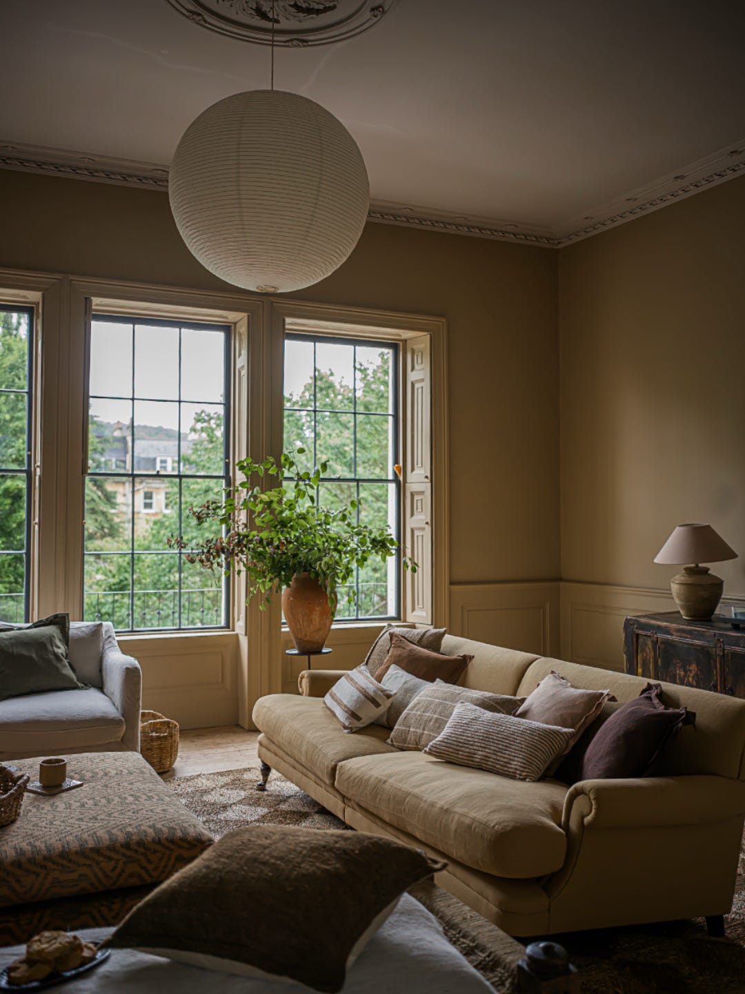
By @gathered.living
You found the paint color. You saved it on Pinterest, saw it in someone else’s house, maybe even brought the swatch home and thought, Yep. This is it.
Then you painted the wall.
And somehow that beautiful warm neutral is pink. The soft white is yellow. The perfect gray is suddenly blue.
So… what happened?
This is one of those things I get asked about ALL the time, and the answer is actually pretty interesting:
You’re never really looking at a paint color by itself.
You’re looking at the paint color + the light + your floors + your furniture + everything else around it.
And that combination can completely change what your eye sees.
THE SAME PAINT COLOR CAN LOOK TOTALLY DIFFERENT FROM ROOM TO ROOM
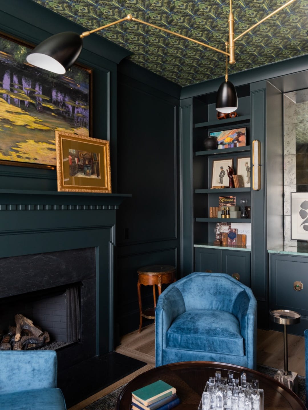
By: @studio36design
I think this is one of the biggest misconceptions about paint.
We want there to be a “perfect white” or a “perfect neutral” that we can use anywhere. But a paint color that looks amazing in your friend’s house might look completely different in yours.
Even two rooms in the SAME house can make one color look different.
Why?
Light.
A room getting warmer afternoon sunlight can bring out warmer tones in a color. A room with cooler or limited natural light can make that exact same color read grayer, cooler or even a little blue.
And it doesn’t stop when the sun goes down.
Your light bulbs matter too. Warmer bulbs can make whites feel creamier or yellower, while cooler lighting can bring out blue or gray undertones.
So when someone asks me, “What’s your favorite white paint?” there really isn’t one answer.
I need to see the room!
AND THEN THERE ARE UNDERTONES…
This is where paint gets sneaky.
You can line up five colors that all look “white” and realize one leans yellow, another pink, another gray and another green.
The same thing happens with beige, taupe, gray, cream - you name it.
And sometimes you don’t notice those undertones when you’re staring at one tiny paint chip.
Then you put that color next to your countertop or flooring and suddenly…
Ohhhh. There’s the pink. 😂
This is why you can paint a room a beautiful color and still feel like something is just… off.
The paint might not be the problem. It might be fighting with an undertone that’s already in the room.
YOUR FURNITURE IS PART OF THE EQUATION TOO
This is the part people don’t think about enough.
Your wall color doesn’t exist in a vacuum.
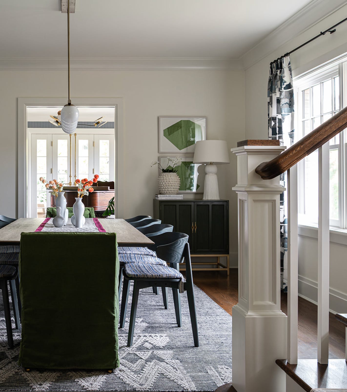
Warm oak floors, a blue sofa, a colorful vintage rug, creamy kitchen cabinets all of those things affect how you perceive the color on the wall.
Even what’s OUTSIDE your house can have an effect.
If you have tons of greenery outside your windows, some of that reflected light can come into the room. Strong sunlight bouncing off a neighboring building can affect what you see too.
Basically, your room is one giant color experiment. 😂
Which is exactly why I don’t love picking paint without looking at everything else first.
SO, WHAT SHOULD YOU CONSIDER BEFORE PICKING A COLOR?

Before you fall in love with a color and order five gallons of it, take a good look around the room.
Here are a few things I always want to know:
What’s staying?
If you’re not replacing your flooring, countertops, tile, sofa or rug, those pieces need to be part of the paint decision.
Look at their undertones. Are they warm? Cool? Creamy? Gray? Is there a color running through several of them?
Your paint should work with what’s already there not fight against it.
How much natural light does the room actually get?
Don’t just look at the room once and decide it’s “bright.”
Look at it throughout the day.
Morning light and afternoon light can make the same room feel completely different.
And if a room doesn’t get much natural light, don’t automatically assume you have to paint it white. Sometimes embracing a cozier or moodier room works WAY better than trying to force it to feel bright.
What happens at night?
This one gets forgotten all the time!
You probably spend plenty of time in your home after the sun goes down, so why would you only test your paint color at noon?
Turn on the lamps and fixtures you actually use and look at the color again.
You may love it during the day and hate it at night or vice versa.
What can you see from the room?
Stand in the doorway.
What room do you see next?
Your entire house absolutely does NOT need to be one color, but the colors should make sense together as you move through the space.
I always want those sightlines to feel intentional.
And most importantly: how do you want the room to FEEL?
Instead of starting with:
What paint color is everyone using right now?
Try starting with:
How do I want to feel when I walk into this room?
Cozy? Calm? Bright? Moody? Fun? Energized?
That gives you a much better direction than picking a color simply because you keep seeing it on Instagram.
PLEASE DON’T PICK YOUR PAINT COLOR FROM YOUR PHONE
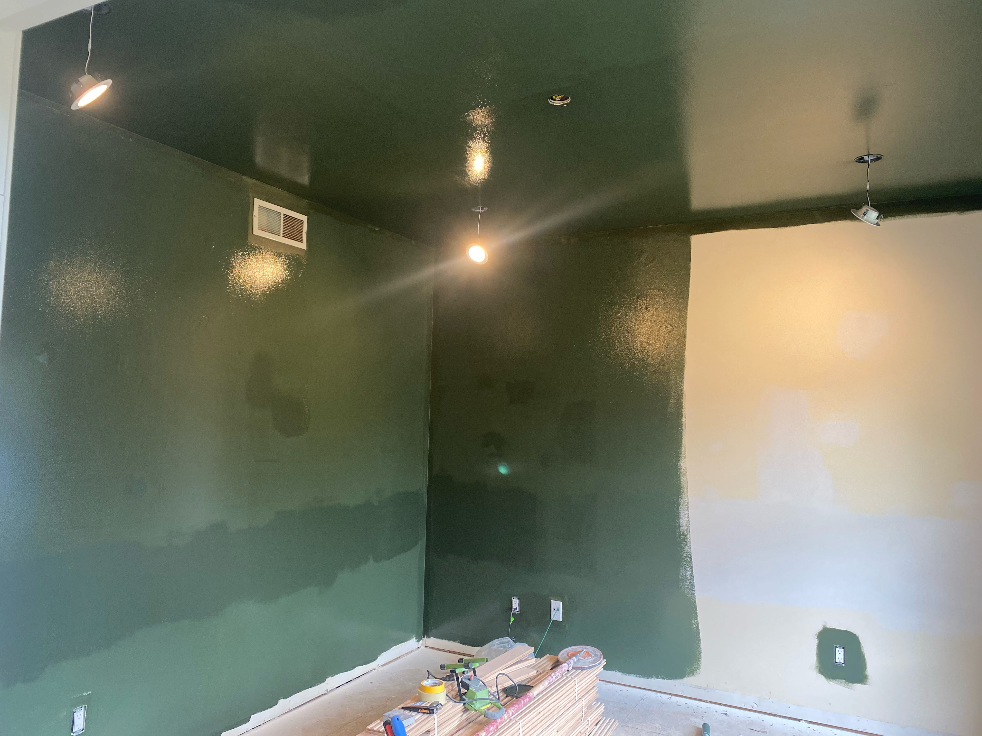
I love Pinterest. I love Instagram. I love saving beautiful rooms just as much as everyone else.
But they should be inspiration, not your paint sample.
Photography, editing, screens and lighting can all change the way a paint color appears.
And remember the room you’re looking at online has completely different windows, flooring, furniture and lighting than yours.
So if you see a color you love online, great!
Use that as your starting point. Not your final decision.
MY BIGGEST PAINT TIP? DON’T TRUST THE TINY SWATCH.

Those little paint chips are great for narrowing down your options.
They’re not great for making the final call.
Go BIG with your sample.
Paint a large sample board or grab a large peel-and-stick sample.
Then move it around.
Put it next to the flooring.
Put it behind the sofa.
Hold it near the countertops.
Look at it on different walls.
Then leave it there for a few days.
Look at it in the morning, afternoon and evening. Turn your lights on at night and look at it again.
It might feel like you’re overthinking a paint color, but trust me it’s a whole lot easier than repainting the entire room.
AND ONE MORE THING: I USUALLY DON’T START WITH PAINT
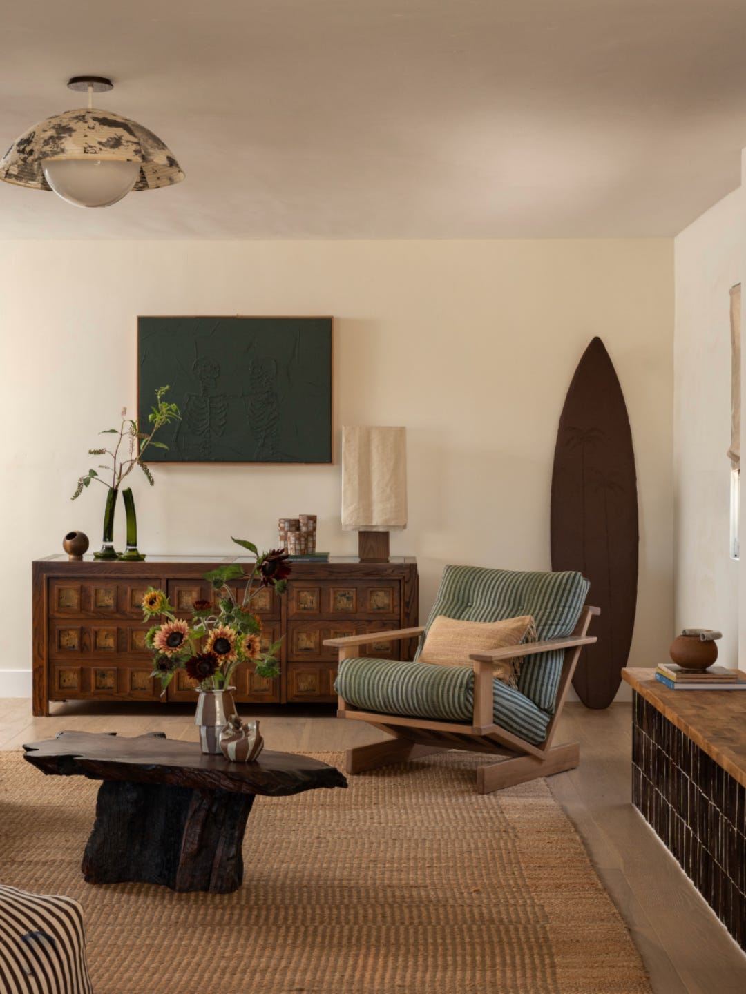
By: @popixdesigns
This surprises people sometimes.
If we’re designing an entire room, paint usually isn’t the first decision I want to make.
Think about it.
There are THOUSANDS of paint colors.
But there might be one rug you absolutely love.
One incredible vintage piece.
One fabric you can’t stop thinking about.
One piece of art you know has to stay.
Those things are much harder to find.
So I like figuring out some of those bigger pieces first and THEN finding the paint color that ties everything together.
Otherwise, you can end up trying to find a sofa, rug, fabric, wallpaper AND furniture that all work with a paint color you picked six months ago.
That’s doing it the hard way.
SO… IS THE PAINT COLOR ACTUALLY WRONG?
Maybe.
But before you give up on it, pay attention to why it looks wrong.
Is it beautiful during the day but yellow at night?
Does it suddenly look pink when you put it next to your flooring?
Does it look perfect on one wall and completely different on another?
Those little clues are telling you something about the light, undertones and other colors already living in your room.
And if you remember ONE thing from this, make it this:
Don’t choose a paint color because you loved it in someone else’s house. Choose it because you love it in YOUR house.
Test it big.
Move it around.
Look at it throughout the day.
Put it next to the things that are actually going to live in the room.
Your future self will thank you.
Before you commit, test it.
And I don’t mean one tiny paint chip taped to the wall.
One of my favorite ways to test paint is Samplize. They make large peel-and-stick paint samples, so you can move the color around the room and actually see how it looks next to your floors, furniture, countertops, and in different light throughout the day.
Move it around. Look at it in the morning. Look at it at night. Give it a few days.
Because the color you loved in the store might look completely different once it gets into your room.
AND IF YOU HAVE NO IDEA WHERE TO START…
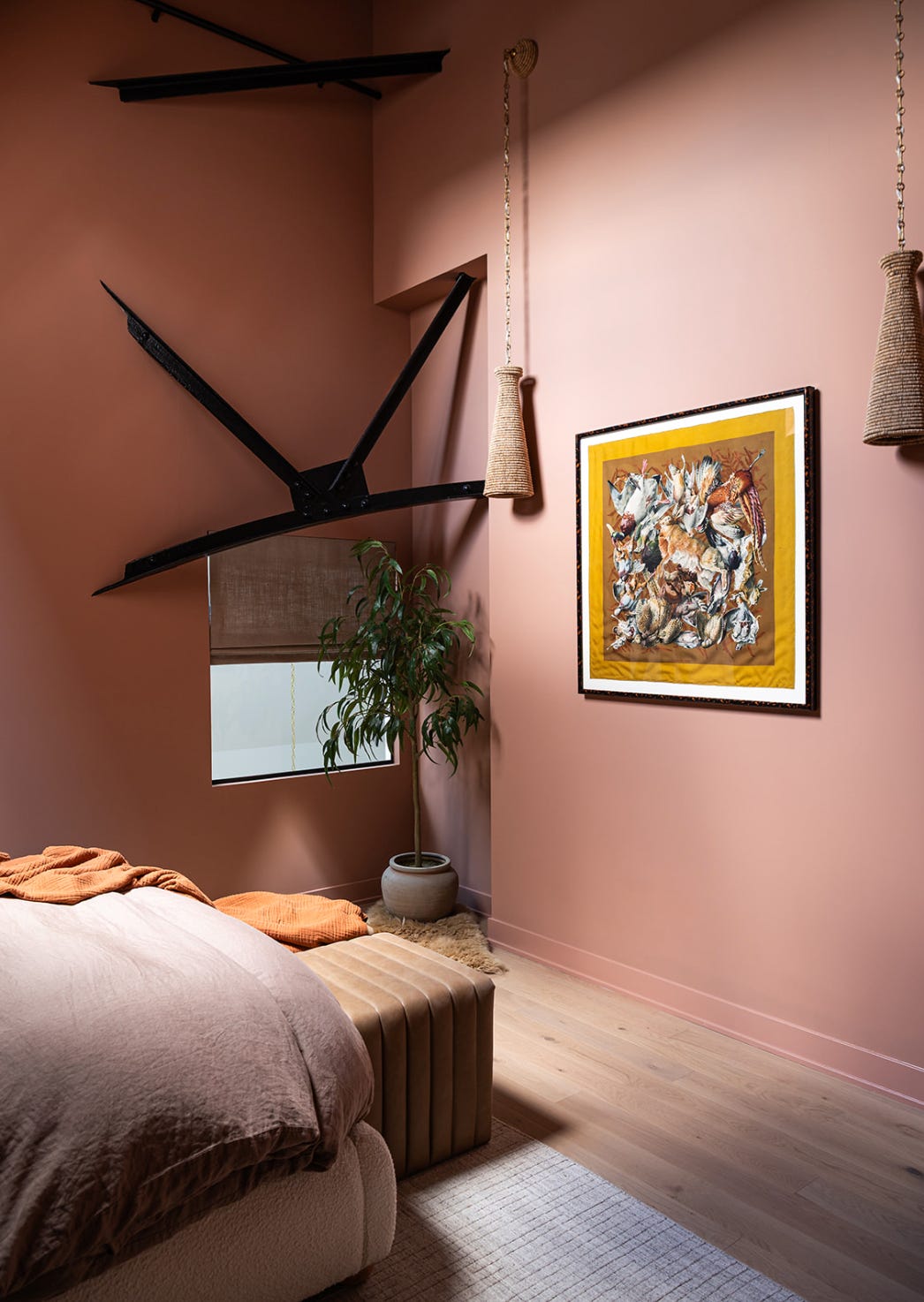
That’s what we’re here for.
Sometimes paint isn’t really the problem. You’re trying to figure out how the flooring, furniture, fabrics, lighting, finishes AND colors are all supposed to work together.
And when you’re making that many decisions at once, it gets overwhelming FAST.
With MegMade Design Services, we can help you pull the entire space together - from floor plans and furniture to fabrics, finishes, lighting, paint colors and all those little decisions in between.
And you definitely don’t need to have your style figured out before you come to us.
That’s our job. 🤎
Ready to get started? Learn more about our Design Services and tell us a little about your project here →
And now I have to know: Have you ever brought home a paint color you LOVED only to put it on the wall and wonder what happened?! Tell me which one in the comments.
Xoxo,
Meg
Leave a comment